Naila Tahbaub - Tastefully Crafted Brand with Elegance
— Art Direction, Brand Guidelines, UX/UI
— Impact on Personal development
Barcelona
Project Overview
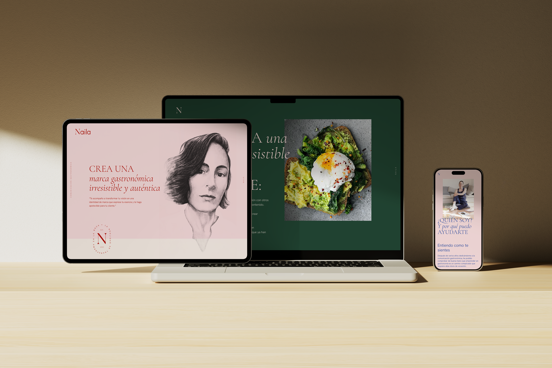
The Naila Tahbaub personal branding project redefined how brand and communication strategy intersects with the gastronomy world. Naila, a renowned strategist for gastro entrepreneurs, sought a modern, minimalistic, and elegant brand identity to reflect her unique approach and resonate with her niche audience. Our mission was to craft a sophisticated brand image, encompassing a versatile and impactful visual language that would stand out in the competitive landscape of gastronomic consulting. The project included art direction, comprehensive brand guidelines, and a UX/UI design for a visually compelling landing page.
Impact
The rebranding significantly enhanced Naila Tahbaub’s market presence and client engagement. By focusing on modern aesthetics and a versatile visual language, the new brand identity created a distinct and memorable impression, effectively communicating Naila’s expertise and value in gastronomic brand strategy. The project not only elevated Naila’s professional image but also positioned her as a leading authority in the field, contributing to her ability to attract and retain high-profile clients.
Key Contributions
Brand Identity Development
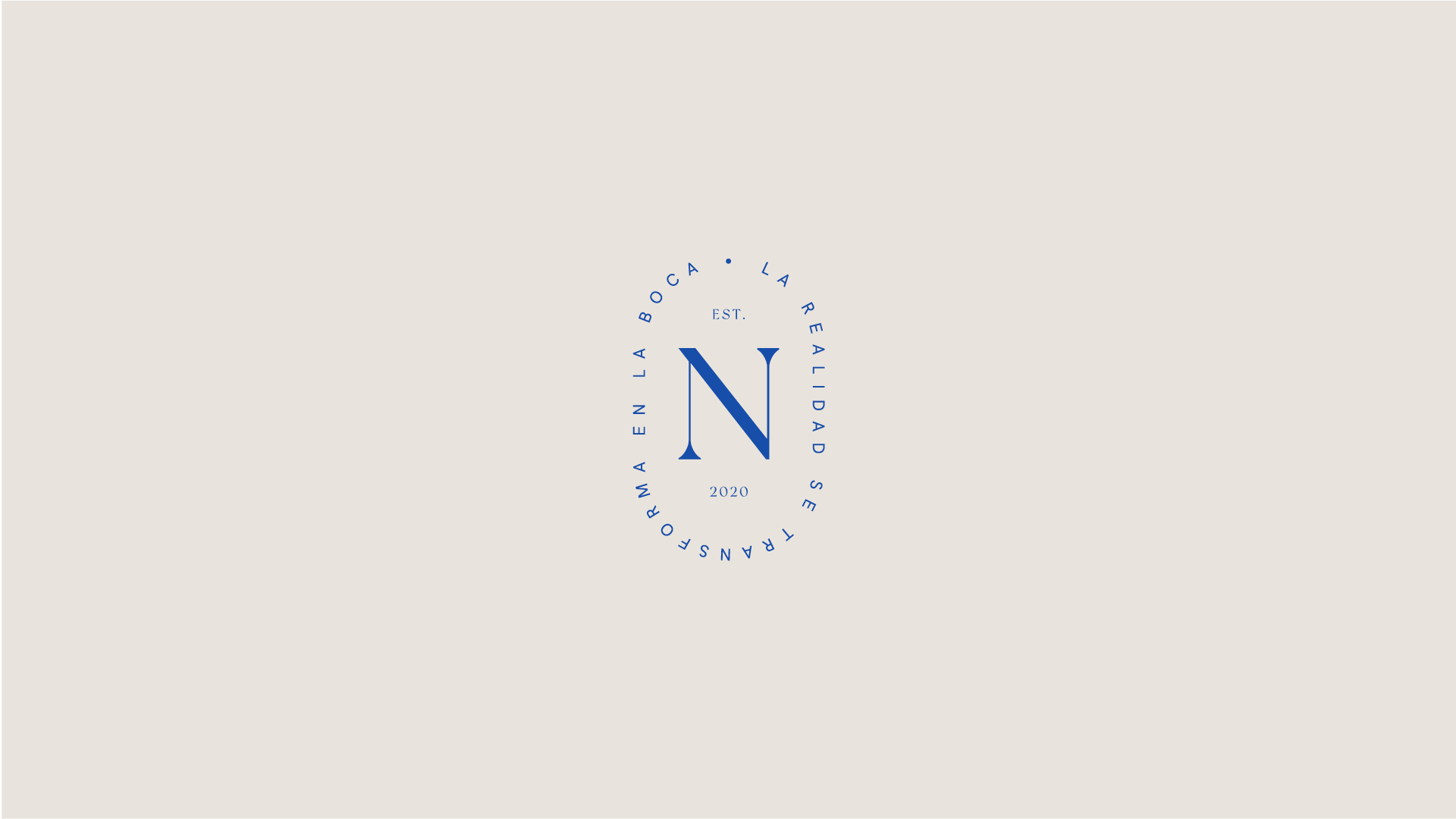
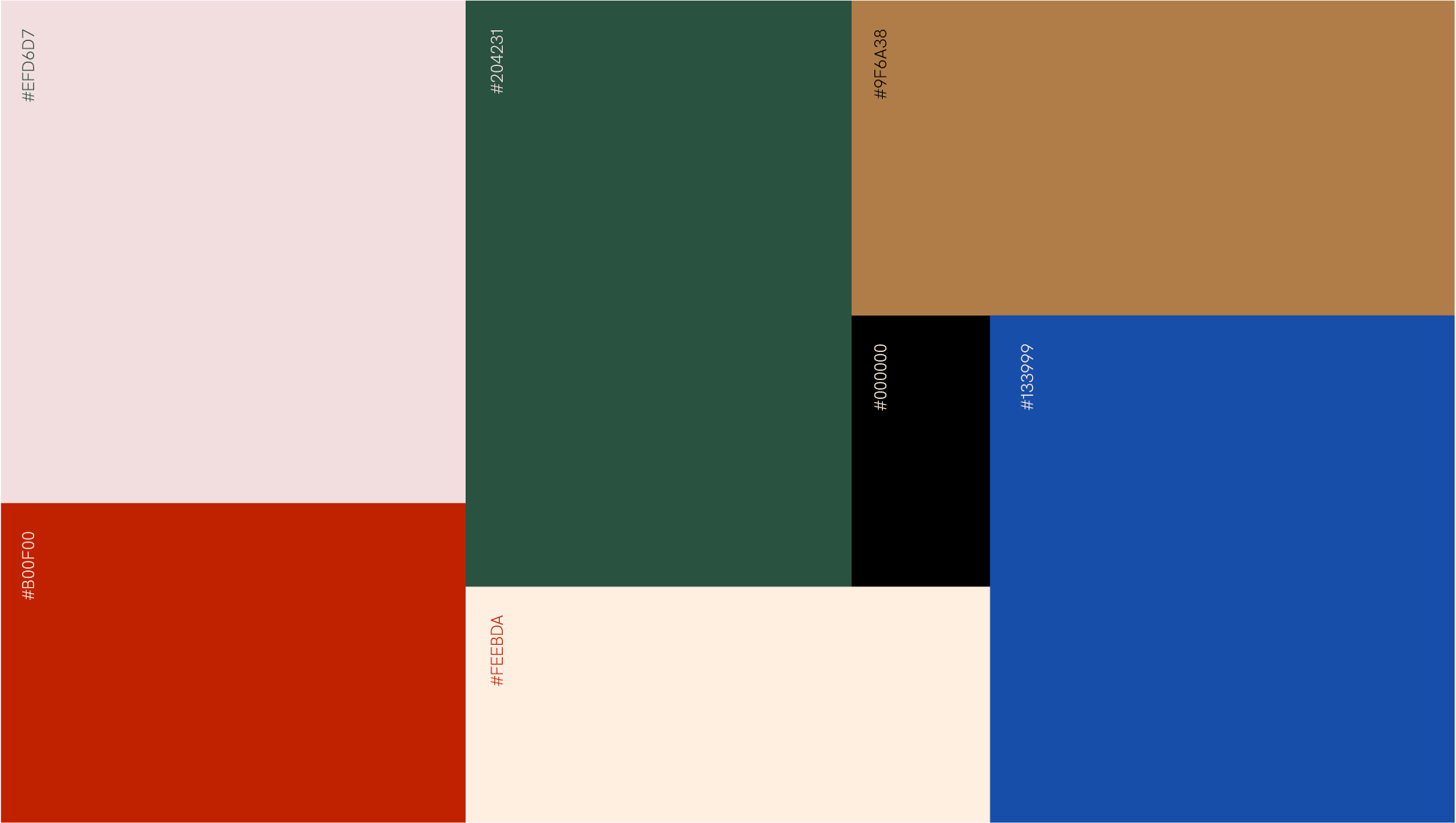
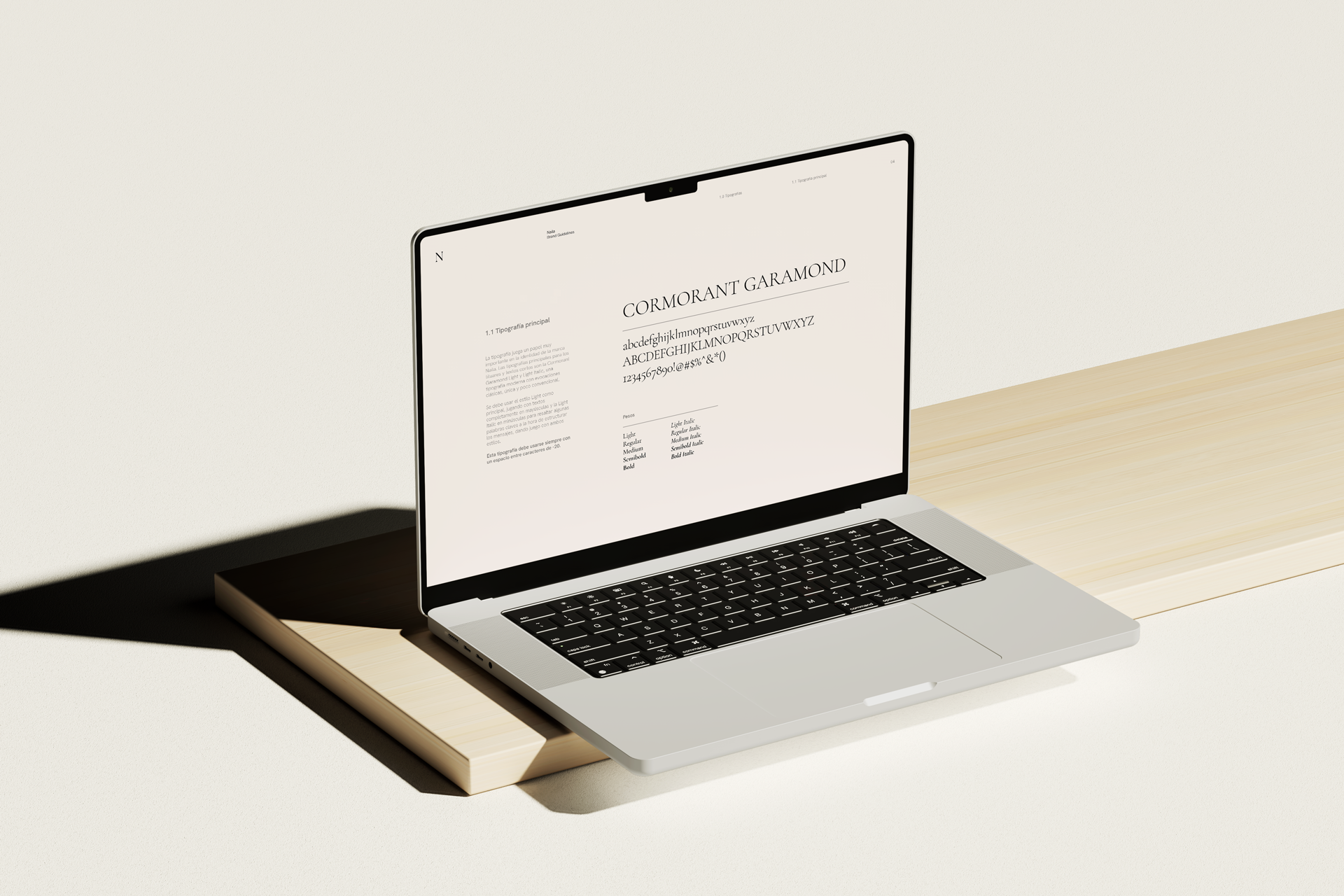
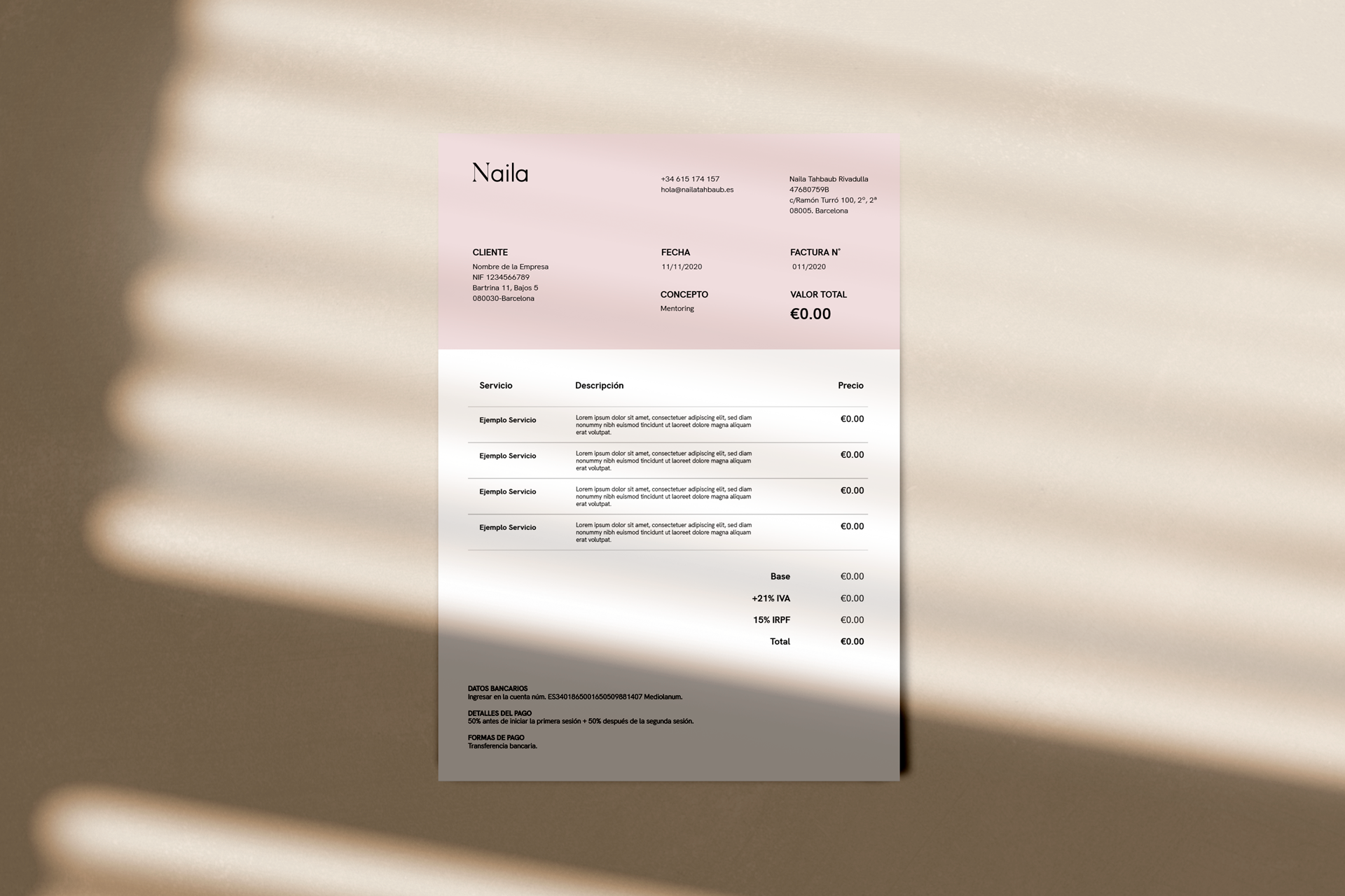
Created a contemporary and elegant brand identity for Naila Tahbaub, integrating a rich color palette and a blend of serif and sans-serif typefaces. This design approach reflects a harmonious balance between tradition and modernity, effectively highlighting Naila’s unique style.
Brand Guidelines
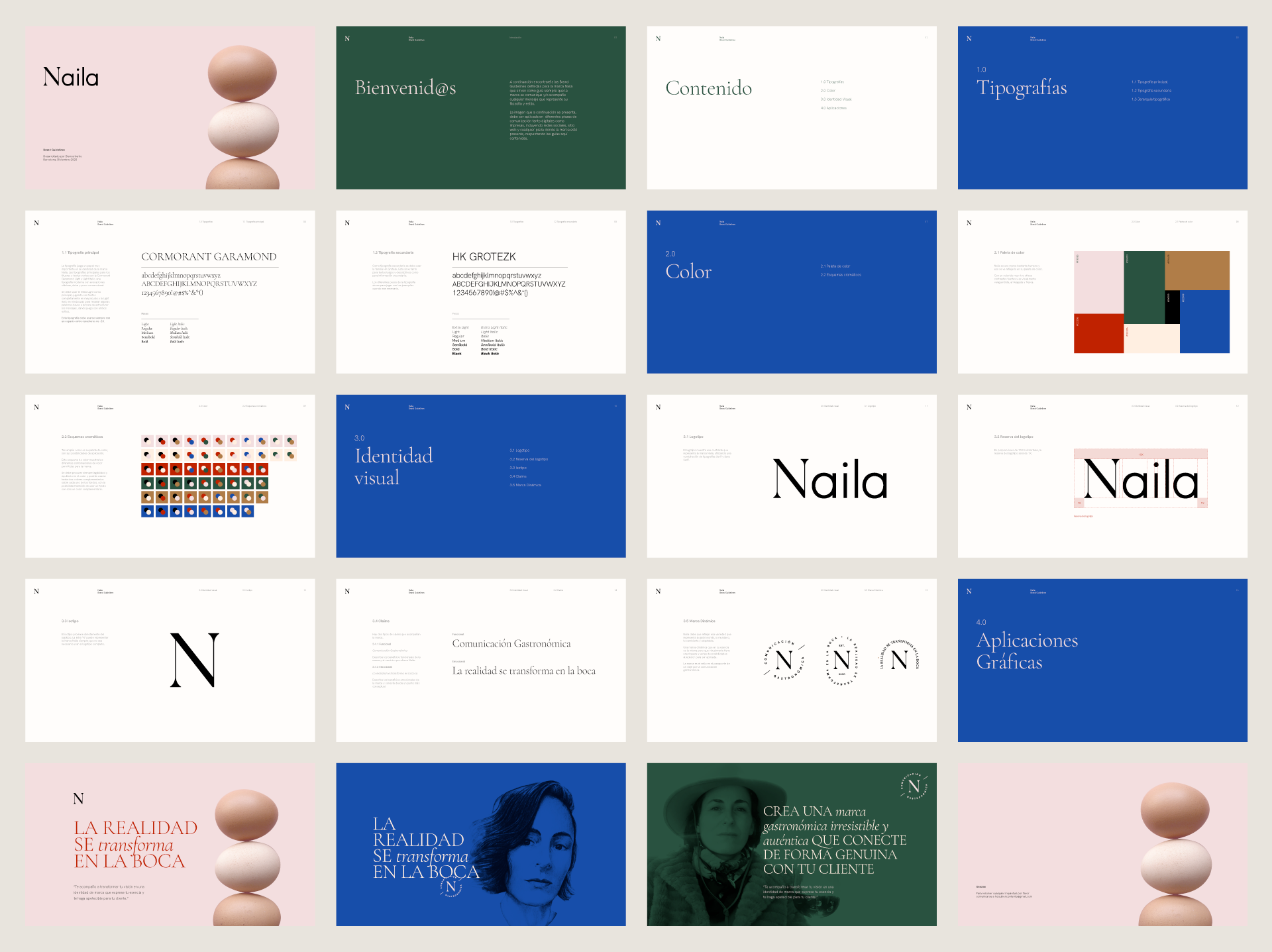
Developed comprehensive and flexible brand guidelines to ensure consistency across all formats and channels. These guidelines provide clear and actionable instructions for maintaining brand integrity and visual coherence.
UX/UI Design
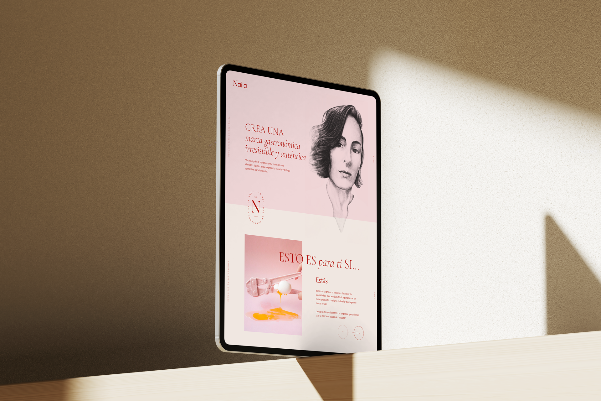
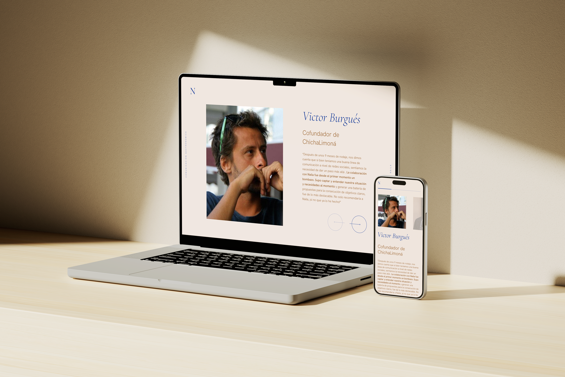
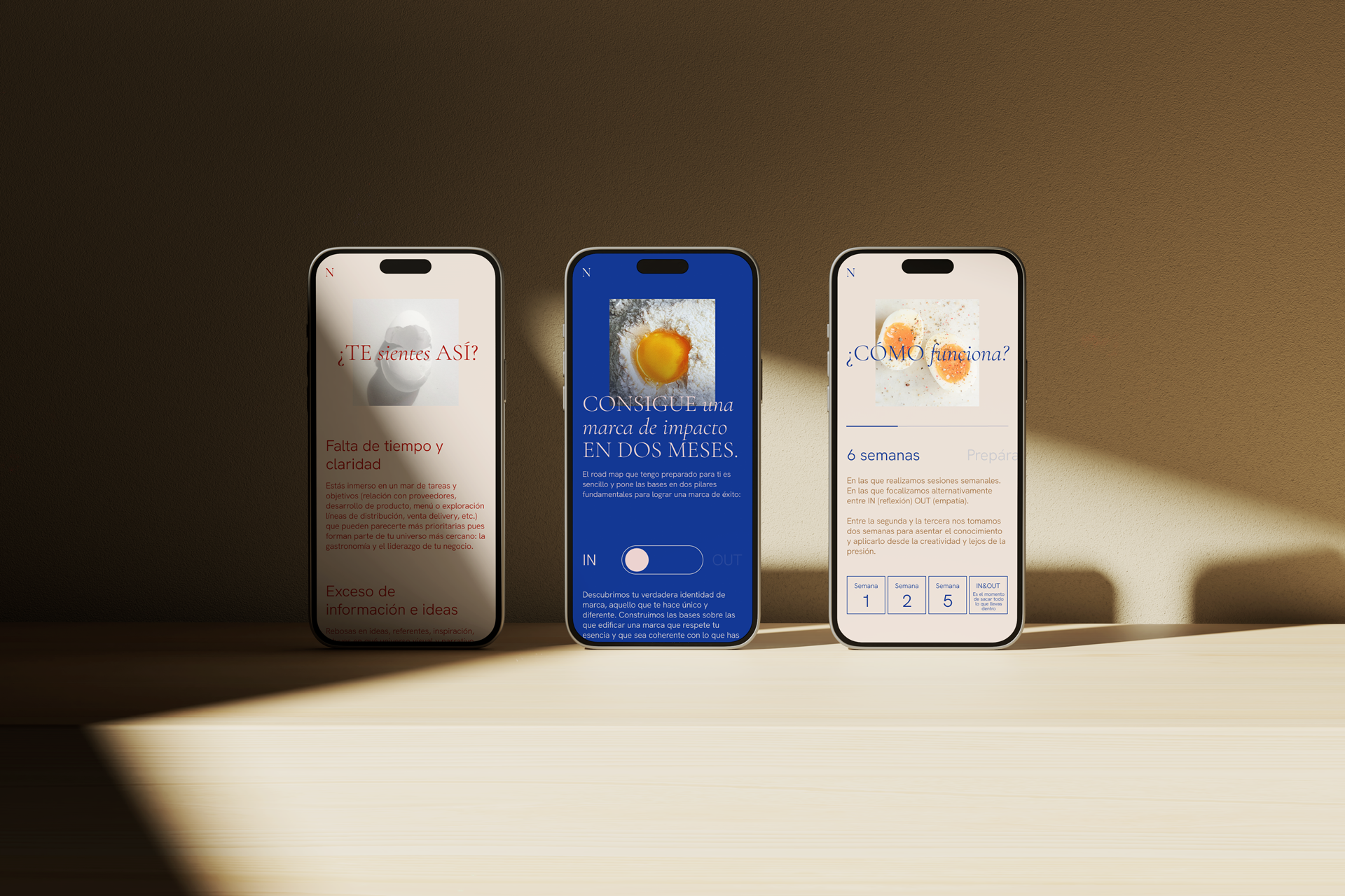
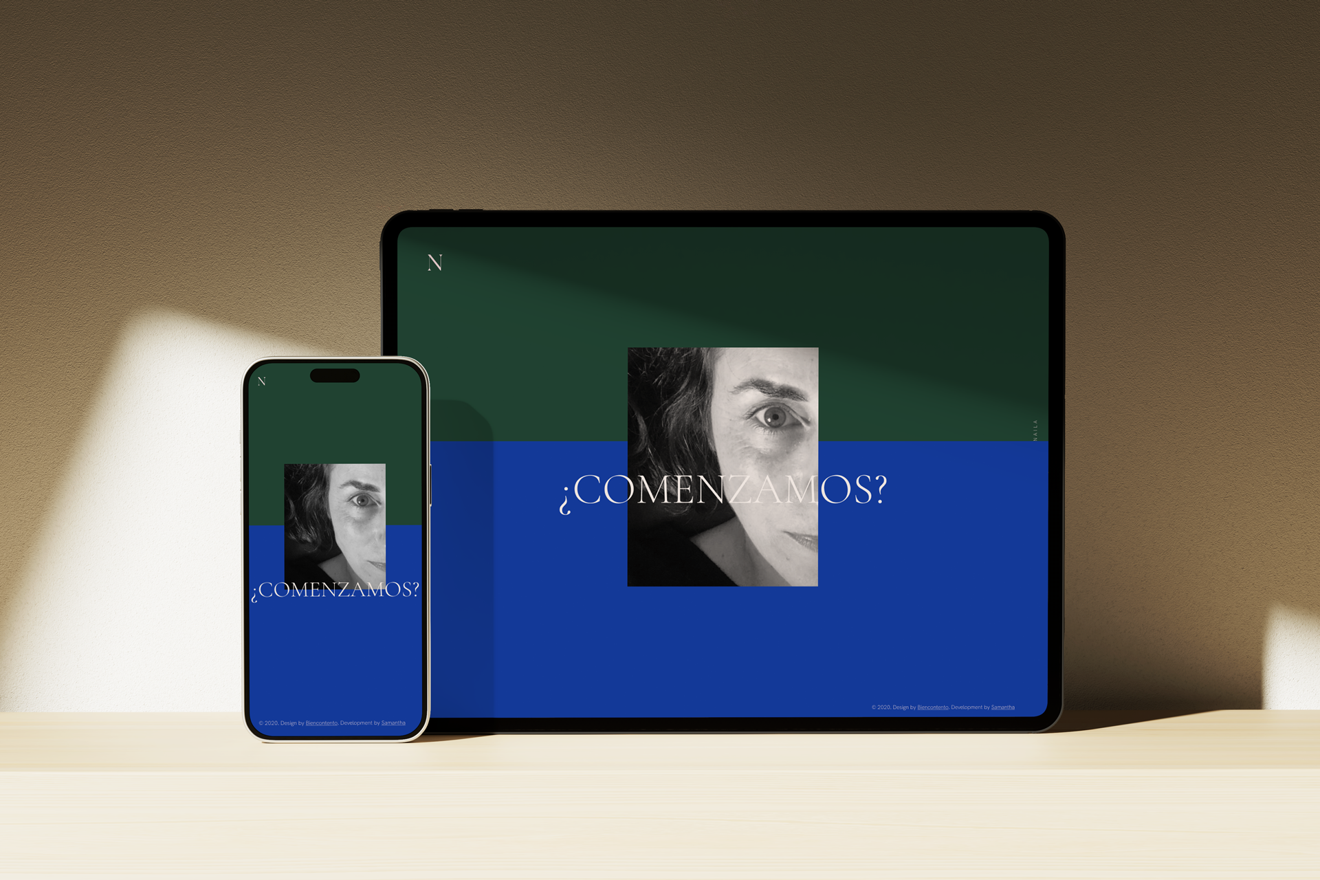
Designed a sophisticated, editorial-style landing page that utilizes the egg as a central visual asset, symbolizing versatility in gastronomy. The site’s clean interactions and well-structured hierarchy deliver Naila’s message clearly and intuitively, enhancing user experience and engagement.
Outcome
The rebranding project resulted in a visually stunning and strategically aligned brand identity for Naila Tahbaub. The elegant design and user-centric website effectively communicated her expertise and credibility, leading to increased client inquiries and enhanced professional reputation. The refined digital presence has been instrumental in showcasing Naila’s unique value proposition and establishing her as a thought leader in gastronomic brand strategy.
— 01
— 02
— 03
— 04
— 05
All eggs in the same basket
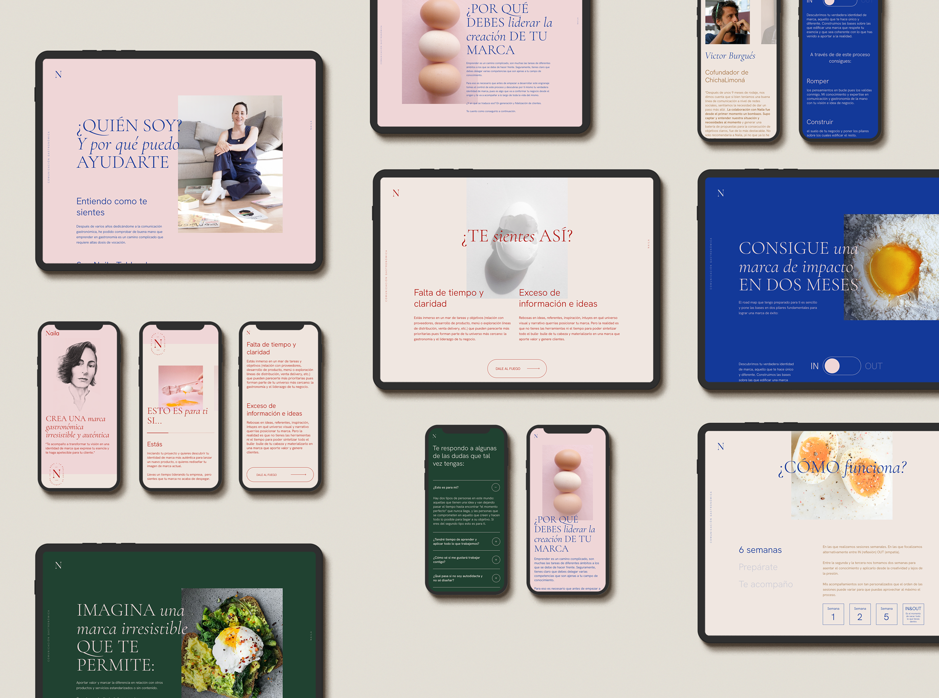
To effectively convey the value Naila adds to her clients, the brand required a visually striking landing page. We chose the egg as a central visual element, symbolizing versatility—a key ingredient in many recipes.
This concept reflects the adaptability of the visual design and ensures the website performs seamlessly across all devices. The design features clean, editorial-style interactions and a well-structured hierarchy, enhancing both readability and user experience.
The result is a fluid, engaging site that communicates Naila’s expertise in gastronomic brand strategy while providing an intuitive and compelling user journey.
— 06
— 07


— 08
— 09
— 10
— 12
Crafted with love in Barcelona 💙